Contract Land Staff, LLC (CLS), is a right-of-way company located in Sugar Land, TX. Their primary use-case for their internal software is to track all activity on a tract so that compensation can be granted to land-owners whom allow utilities to pass under or above their property. CLS had a proprietary mapping application in which all of this tracking could be done. However, it was a flash based application that required Adobe Flash player to be installed and allowed for use in a browser. With the announcement that flash would no longer be offering browser support, CLS decided to move to a web-based platform and essentially re-develop their mapping app. I was hired as their usability expert and software developer to help complete this replacement mission. Unfortunately, due to the nature of proprietary software, I am limited in the screens and documentation I can display on my own personal website.
The first steps of my process are exactly what you would think. Introduce myself to the users, get to know them and their goals, and perform interviews with the Subject Matter Experts (SME's). Fortunately, in this role, I had already been working with CLS for 2 years and was well versed in industry knowledge and well acquainted with my colleagues who would be using the new software.
Many of our users were field agents, so we knew they would often be entering data from the field, as such they would need a reliable and usable platform to do so from a phone or a tablet. This was the goal of the design. You'll see (below) that we utilized a number of the Google Material design principles for successfully achieving this usability goal; We customized and adjusted where needed.
The development team decided to move forward on this project using a single page application (SPA) and model-view-controller (MVC) architecture. In my opinion, this was a safe decision, as the team was already familiar with these technologies and they do not have many limitations in regards to implementing the desired UI. Both also lend themselves well to web-component usage and code reusability.
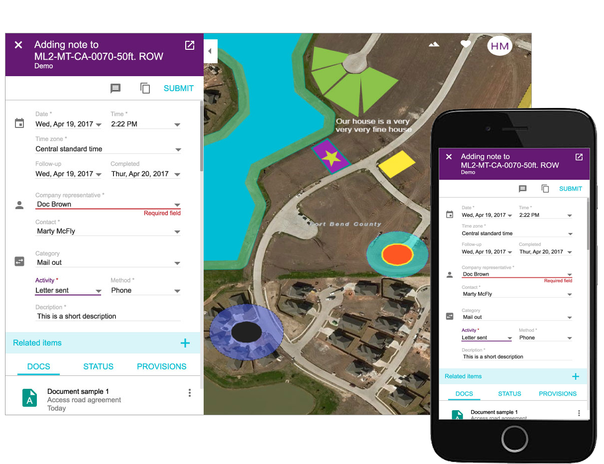
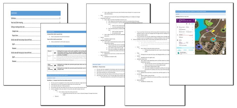
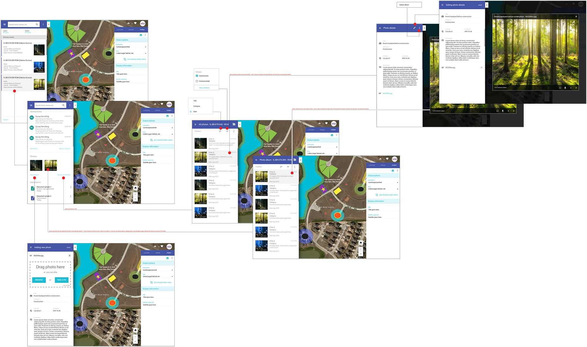
Prior to my role at CLS, I was primarily known for my web design. I found that I naturally had the instinct needed to migrate into usability. While I had used these skills in web design for many years, this was my first official corporate role where I was entirely responsible for the UI/UX. Here I learned exactly how important it was for developers to have a clear understanding of acceptance criteria and flow before development begins. Below are a couple samples of documentation I would provide to the development team. (Top: Activity note comments, Bottom: Photo viewer workflow)
For this project, CLS was able to compare application metrics with the metrics from their original platform. One specific example where improvement was measured was in a few data entry screens. These were known by users as "The TractWizard" In this portion of the new platform we had clients reporting their entry process for all ROW tract information on the original platform took just shy of 10 to 15 minutes per record. Data entry on the new, more user-friendly application took them roughly 1 minute 30 seconds. Data entry speeds increase more than 10 times over! As a usability expert, THAT is something to get excited about. Obviously, they were more than pleased with the massive increase in efficiency.